Monday, May 11, 2009

building re-creation


this is the Nakagin Capsule Tower designed by Kisho Kurokawa located in Tokyo. It is actually constructed of two individual towers, although it's hard to see. I chose this building because I like the look of capsule architecture and seeing as though this is the first building built to utilize this form, it's only appropriate. This isn't the only reason behind my affair with this building, as it is located in Japan and I have a thing for Asians. I hope to attend school in Japan due to my infatuation with their culture. Unfortunately, these towers are to be demolished as they have fallen into a state of "disrepair". There's also the asbestos and the whole not earthquake proof issue, but I mean come on, it's capsule architecture damn it! there's two versions of this, but i like this one more. it's depressing and reflects the building itself at this point in time.
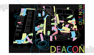
typography poster

i had fun. the colored tape on the various peripherals is created using ridiculously tiny text. i'm planning to send this to the man himself for an opinion. i'll keep in touch on that.

logo project

this was a fucking group project. i fucking hate group projects. regardless, things worked out. we had to create a logo for this realty firm based in arizona. it was fun! no, no it wasn't.


website redesign

this is my sex book indian man. he is badass and fucking sexy at the same time. the fourth project and once again i just found myself having too much fun. scratch that, you can't have too much fun. bloody scalps anyone?

dreamscape

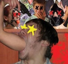
our third project. here's my description: i am not a masochist. nor a sadist. the theme of my dreamscape is television and it's s&m tendencies. i feel the image is self explanatory given that statement. the people are watching me shoot myself in the head and enjoying the show. just as in modern television, particularly reality television, watching people humiliate and embarrass themselves is for some reason pleasant. i don't pretend to understand. i used a judge's podium as the back drop to reflect the judgment that is being passed upon my actions. the child and jesus have no x's on their eyes because they are tools. the x on the head represents damnation in religion. the child is innocent and doesn't understand what's happening, hence the shocked looked on his face. by showing such things as being acceptable, would the youth not become perverted through it? he's in front of the upside down flag, a sign of distress, to reflect that he is our future. although the theme is television, i want it to reflect the media as a whole. jesus is being used by america. i'm sure jesus wouldn't condone quite a bit of the things that happen here in the us of a. still, he is used as a pawn to justify certain actions. there are other subtleties to it, but what fun would the picture be if i explained everything?

time and place project

Our second project. My love for Takeshi Kitano and my fascination with Asian culture made Violent Cop a logical choice for my project. The project proved to be quite a challenge given the quality of the film. As you can see, the film wasn't recorded in the highest quality. Given that it's Takeshi Kitano, it's probably safe to say that this is a B movie. Recreating that look was very difficult. To be honest, I don't think I was able to fully recreate that look. I spent a lot of time tweaking little things, trying to get the look down but I feel as though I wasn't able to fully capture it. Given the range of knowledge I have regarding the program at this time I don't think I could. I almost scraped the whole project half way through, but I figured the challenge would make the product that much more rewarding. To a certain extent, it was.


magazine cover

our first project for computer graphics. i had too much fun and i got carried away.